

The design of jerseys and team logos is something that has always intrigued me. I always thought I was the weird kid around because I used to draw new logos and uniform designs for the Redskins in my notebooks as a kid to kill time in the classroom. Apparently I wasn't alone. In the last few years, I've discovered the ESPN counterpart to my secret obsession in the Uni Watch, a much more detailed insight into sports outfits and regalia than I've ever considered. My thoughts have typically been limited to football, hockey and basketball, as I'm not that big into baseball, so I'm not as schooled in that area.
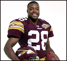
One of my old ideas (as the always critical Redskins fan) was to retool the old uniforms and make them a little more "modern." This idea, circa late 1990s, was to actually look into a more spear-based logo, similar to the 2002 (70th anniversary) design. My idea would have taken things a step further, with a white home jersey with a similar look, but no awful gold pants. The concept of the 2002 jerseys was OK, but the look was a little too different from the current jerseys, and the burgundy was too dark, almost like the Chicago Maroon that my Hokies wear.
Anyway, this article does have a point. I'm a huge fan of the 'Skins uniforms in retrospect, and I want them to stick to what they have. The more I've thought about it, the classier I think they are, and the more unique it is becoming in today's NFL. On the same note, I wouldn't mind seeing the Burgundy jerseys on the road a little bit more. I understand that the Skins, Cowboys and Dolphins are the only teams that usually wear white at home, but I feel like it would be nice to wear burgundy more than just the one Dallas away game every year (besides the random Eagles game last year of course). That's all I really have for tonight. Hopefully I'll be back into the swing of things within the next few days.
1 comment:
I seem to have stumbled upon someone with the same interest as myself. I attend Virginia Tech as a freshman, and have watched them as well as the Washington Redskins for as long as memory will take me. I am also a huge NHL fan (hurricanes...sorry if you're a caps fan.). Upon lately I had been thinking of a new jersey for the skins and just as you did--came to realize how unique our jersey's were. Now there are a few things I would like to see changed...
The colors are very nice, but sometimes I feel as if they are too "light" I don't like the maroon on them as much as on the hokies but I feel like the burgundy is close to approaching red...and the yellow...just a bit dimmer and it would be perfect.
Now, I admire the idea of a spear type logo...maybe with the cursive "R" that Joe used to wear on his hats at games. With that R, I wouldn't mind seeing a yellow/Gold helmet with a single burgundy stripe down the center.
Last with reebok releasing their new jerseys to the NHL and NFL, I think the arms just look stupid! They tuck up into a players armpits such that the stripes on our sleeve are no longer visible. I think these are definitely the new generation of jerseys but lets try to maybe adjust our stripes to somewhere a bit more visible.
-VPIguy12
PS: For whatever reason, I really really would enjoy seeing a yellow helmet.
Post a Comment